Caña de Oro — Brand Identity
The Brief
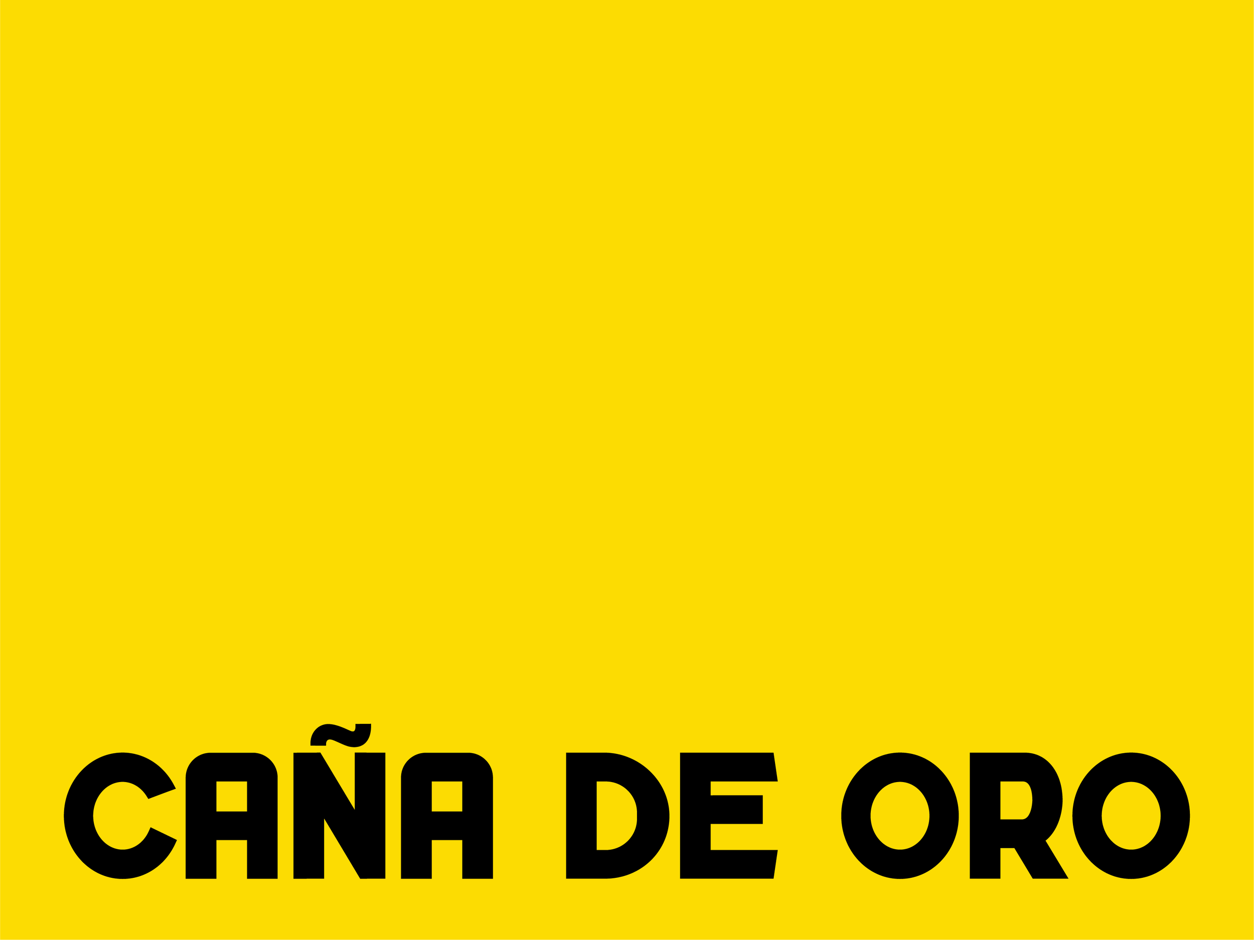
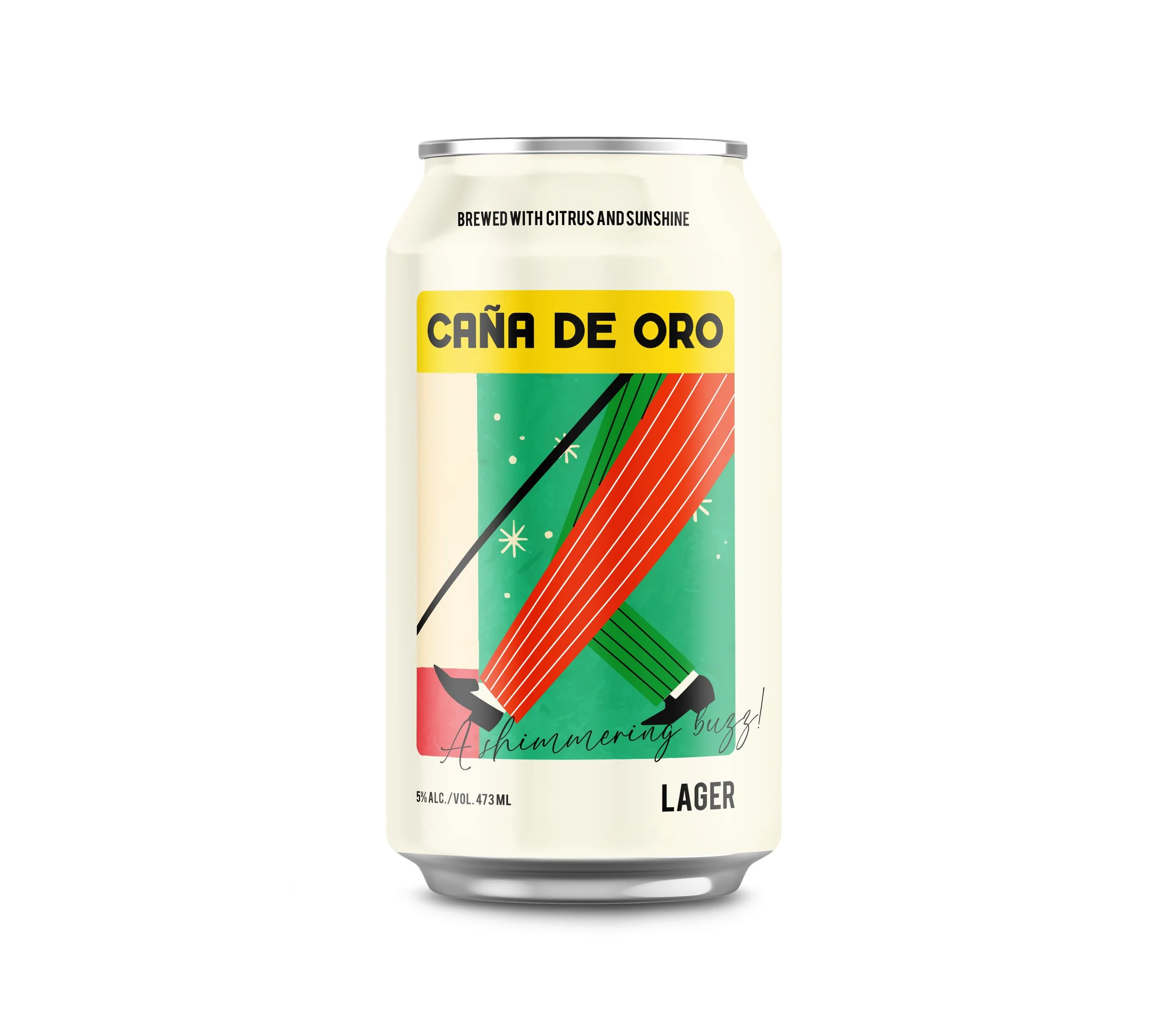
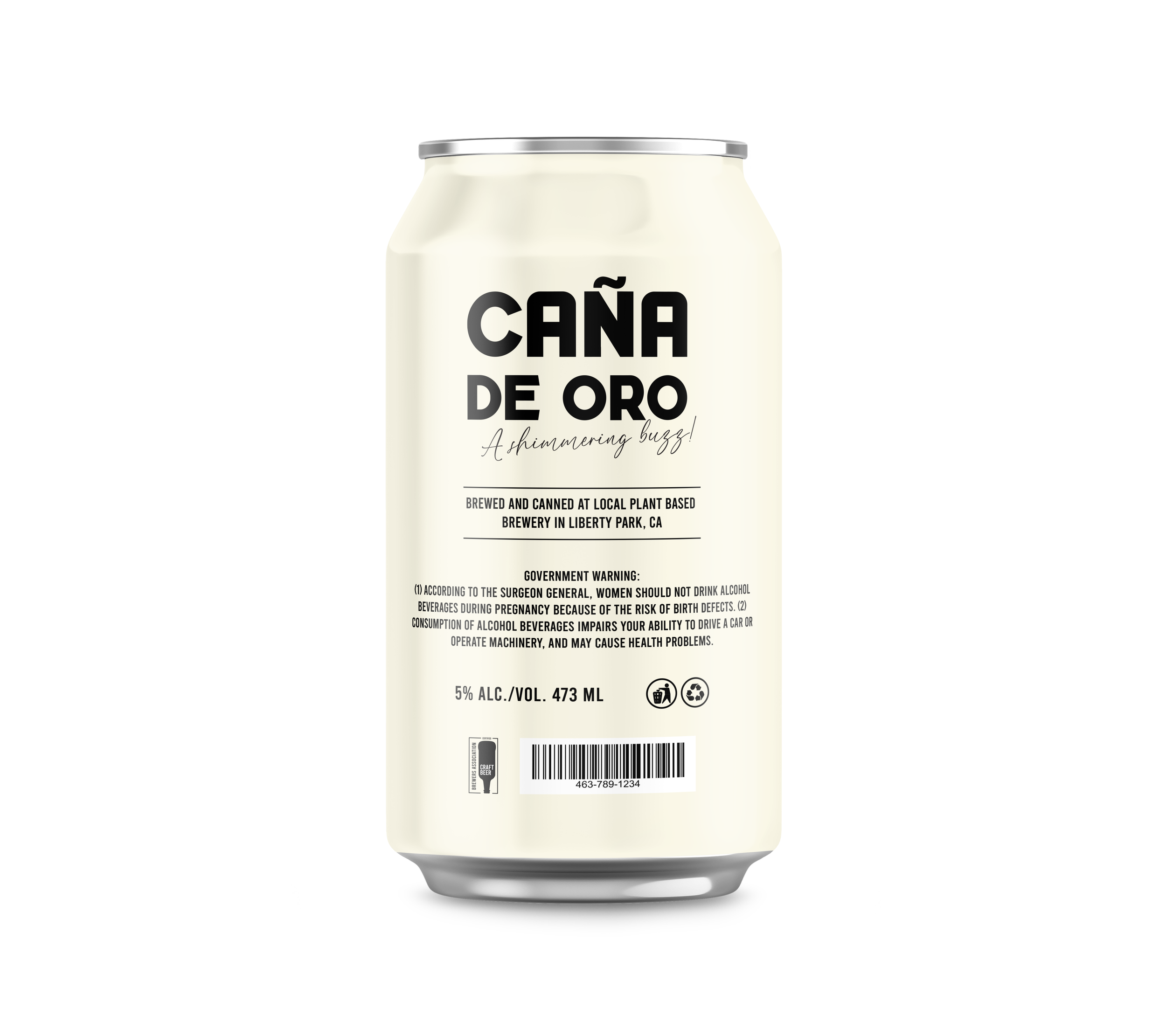
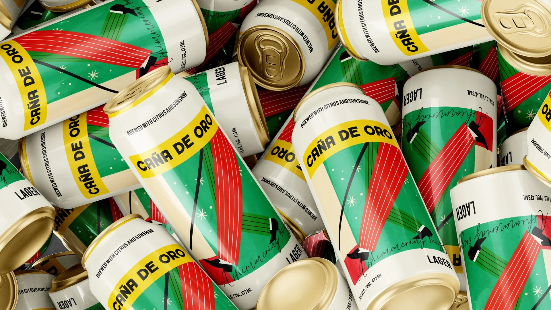
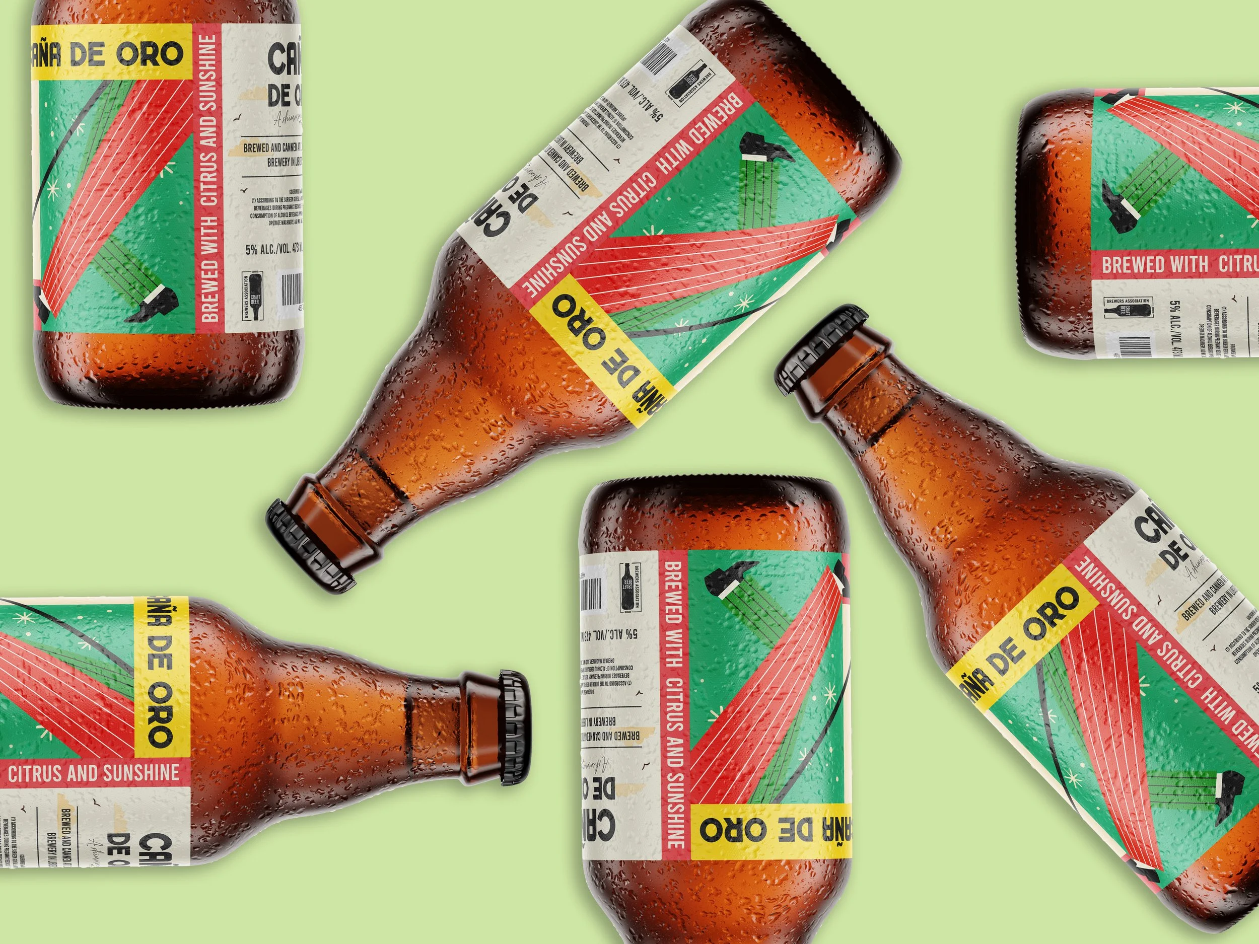
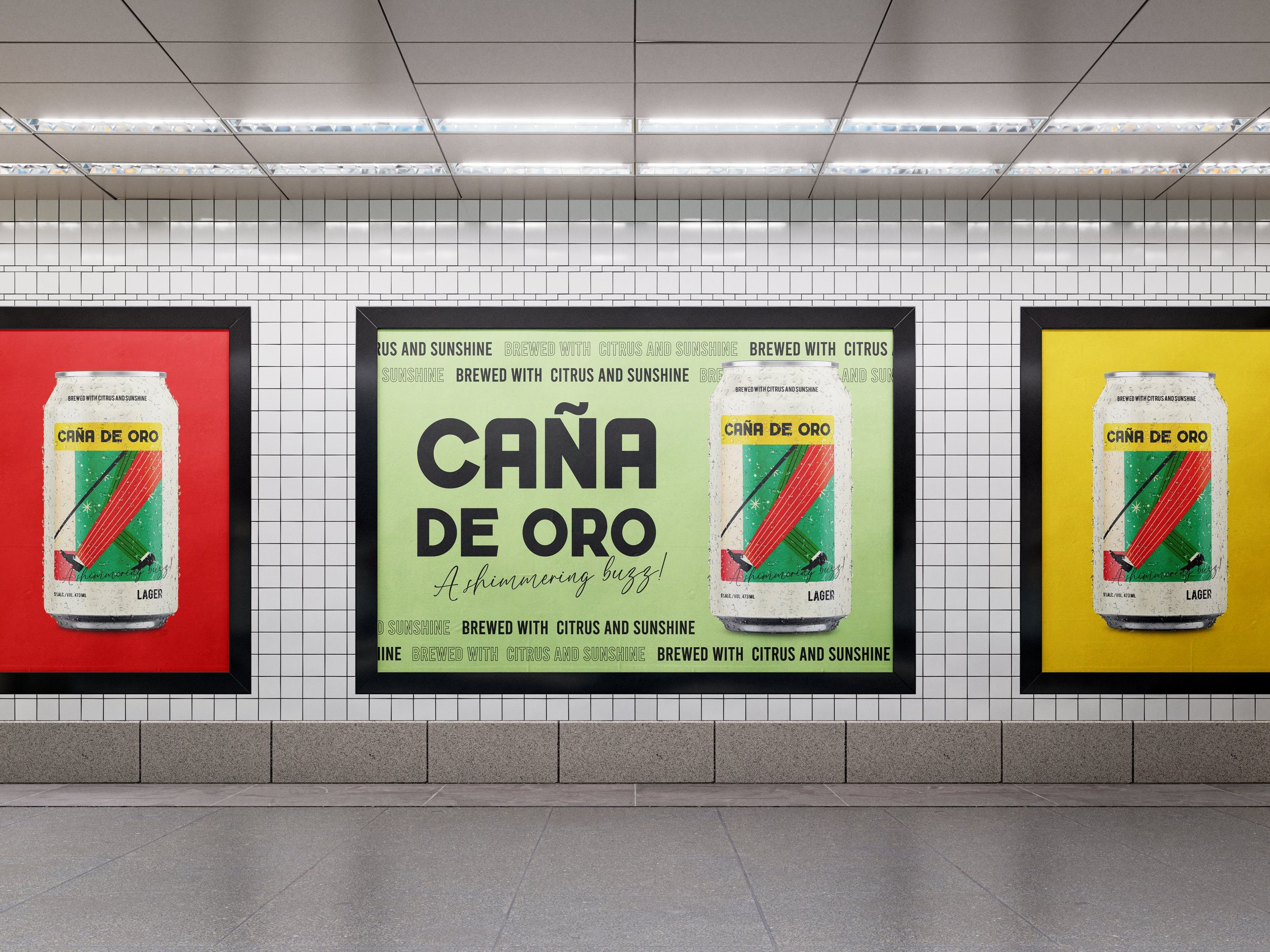
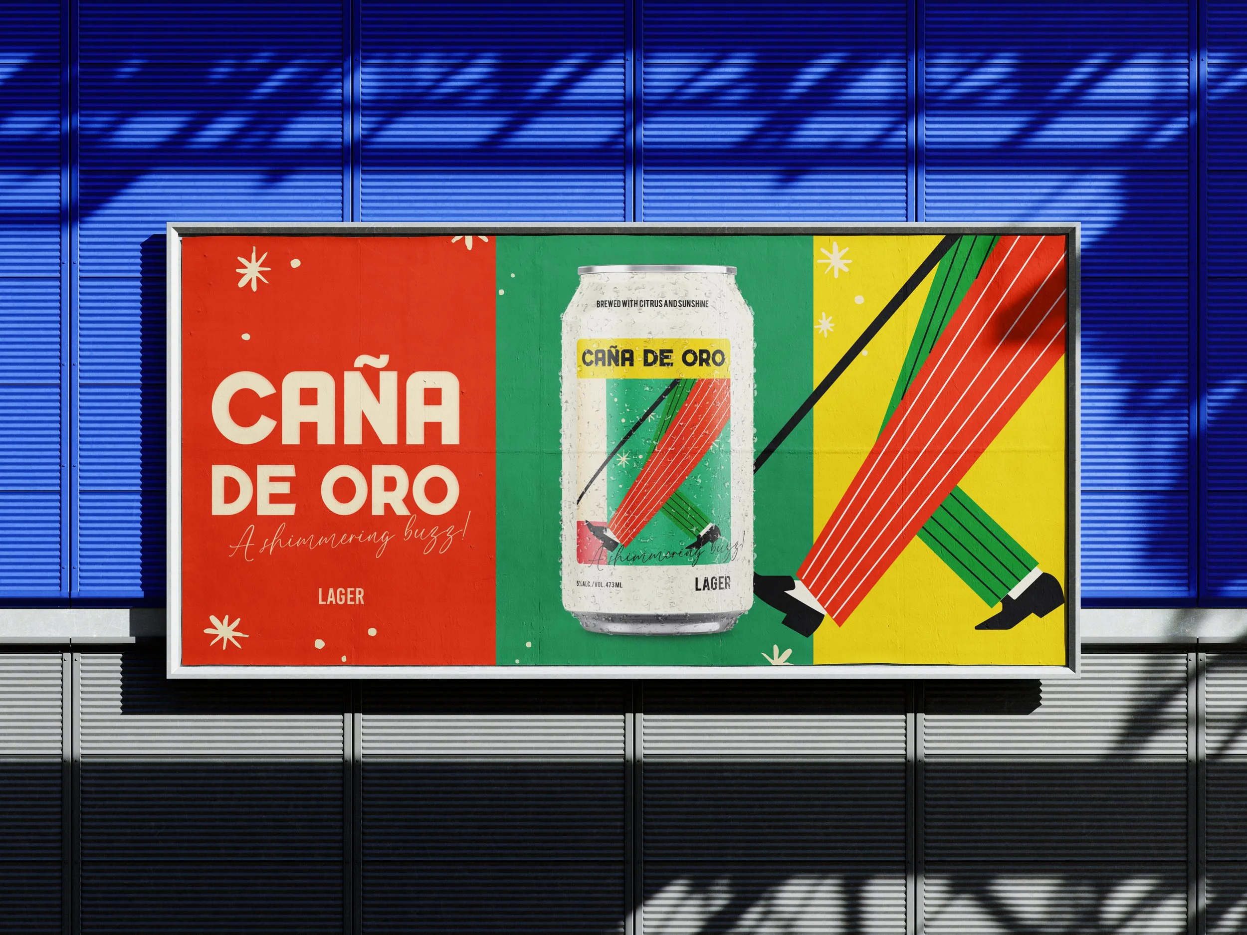
This project began as a design test set by Ubisoft Toronto — the brief that ultimately landed me a role on their branding team. The challenge: create a complete brand identity for a Cuban beer called Caña de Oro, meaning "golden cane" in English.
The Approach
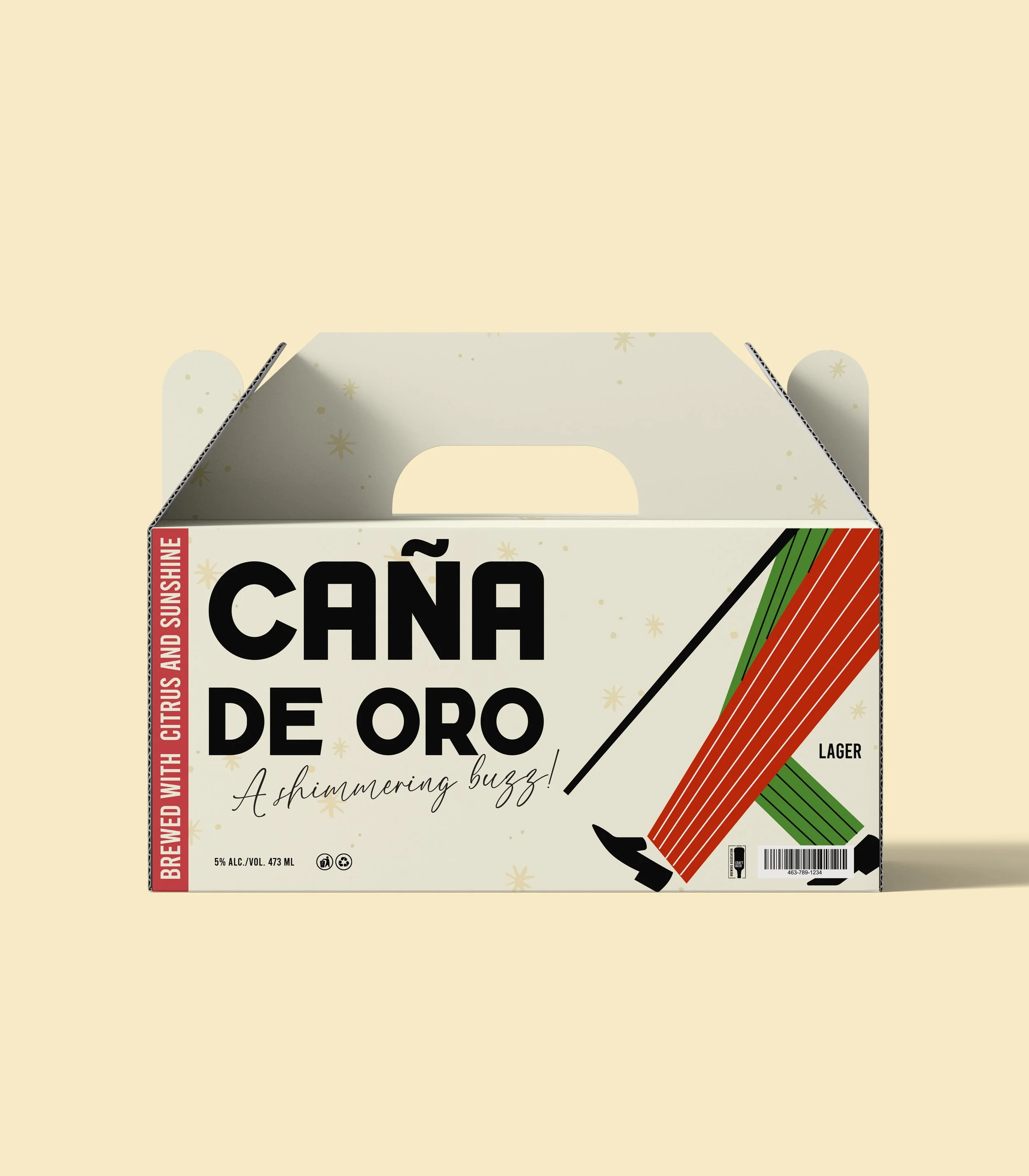
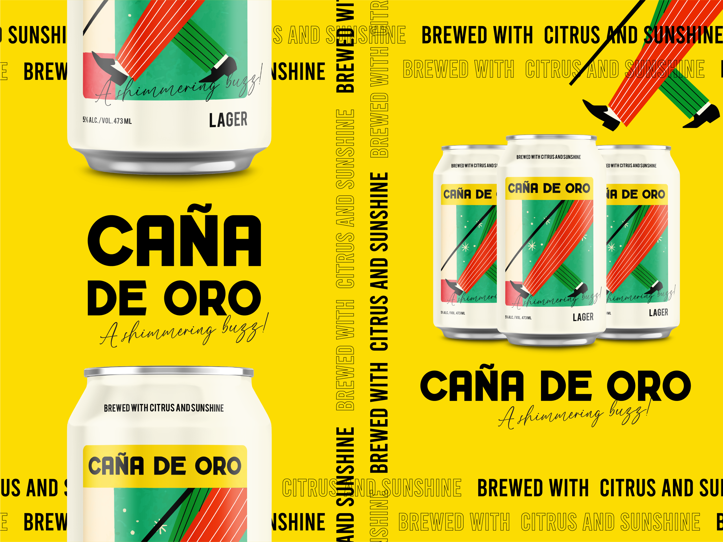
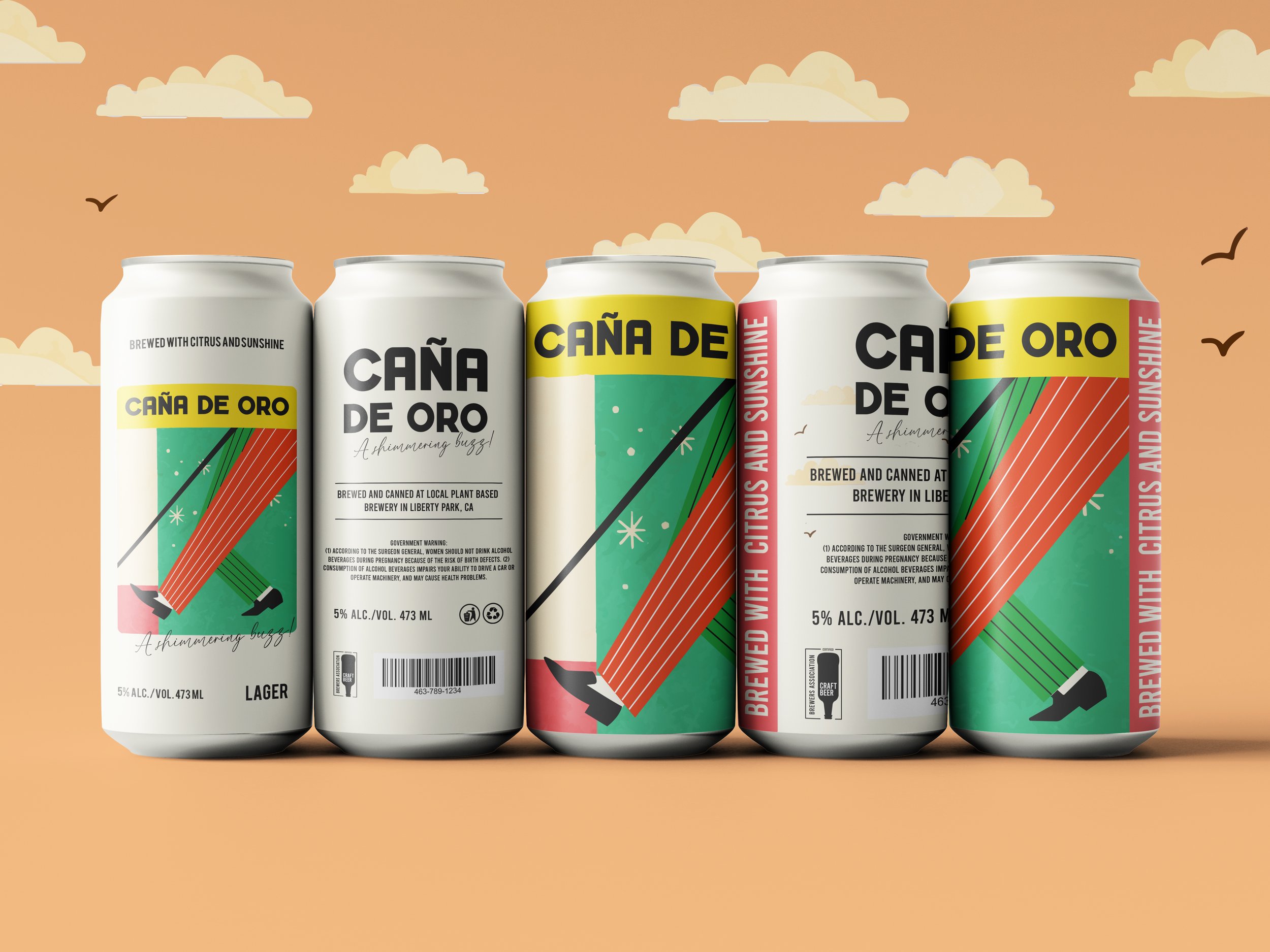
Cuba has a rich and specific visual culture — warm, vibrant, layered with nostalgia. The risk with a brief like this is leaning too heavily into cliché. My goal was to honour the cultural root without becoming a pastiche of it. I anchored the concept in modern nostalgia — an aesthetic that feels rooted in a specific time and place (Cuba in the 1980s) but is designed for contemporary eyes. The colour palette is deliberately bold and warm, drawing from Cuban retro design traditions that favour directness and clarity over decoration. The illustration style is simple and graphic — confident lines, limited colour, high impact. The result is a brand that feels culturally grounded and visually joyful — the kind of label you'd pick up in a bar because it made you feel something before you even read the name.
This work was submitted as part of the Ubisoft Toronto design test and led directly to my being offered a position on their branding team for the Splinter Cell remake — one of the most significant game reboots in recent memory.
Deliverables
Visual identity · Brand guidelines · Packaging design · Illustration · Billboard and environmental mockups