Chop-Chop — Brand & Creative Direction
The Brief
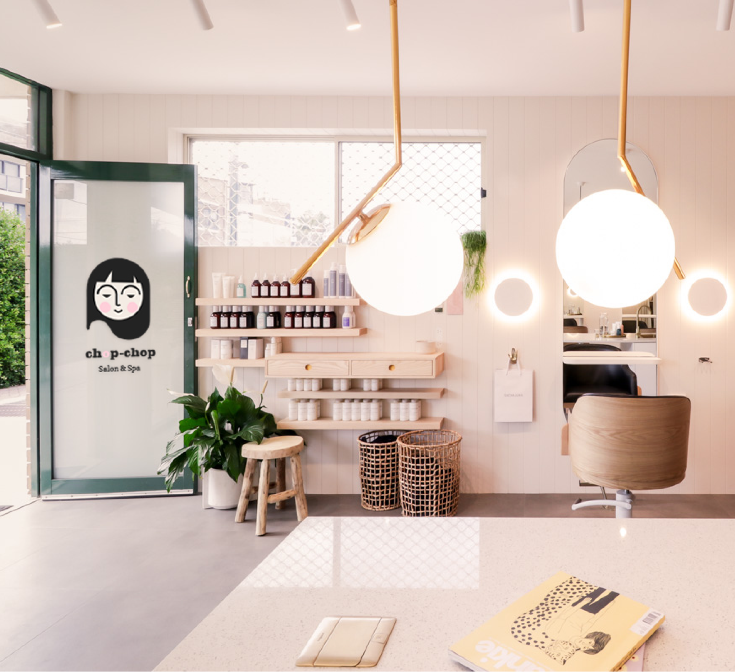
Chop-Chop is a full-service beauty studio offering a broad range of hair and beauty treatments. The brief was to build a brand from the ground up — identity, print, digital, signage, and social — for a digitally-native audience who expect brands to feel as considered online as they do in person.
The Approach
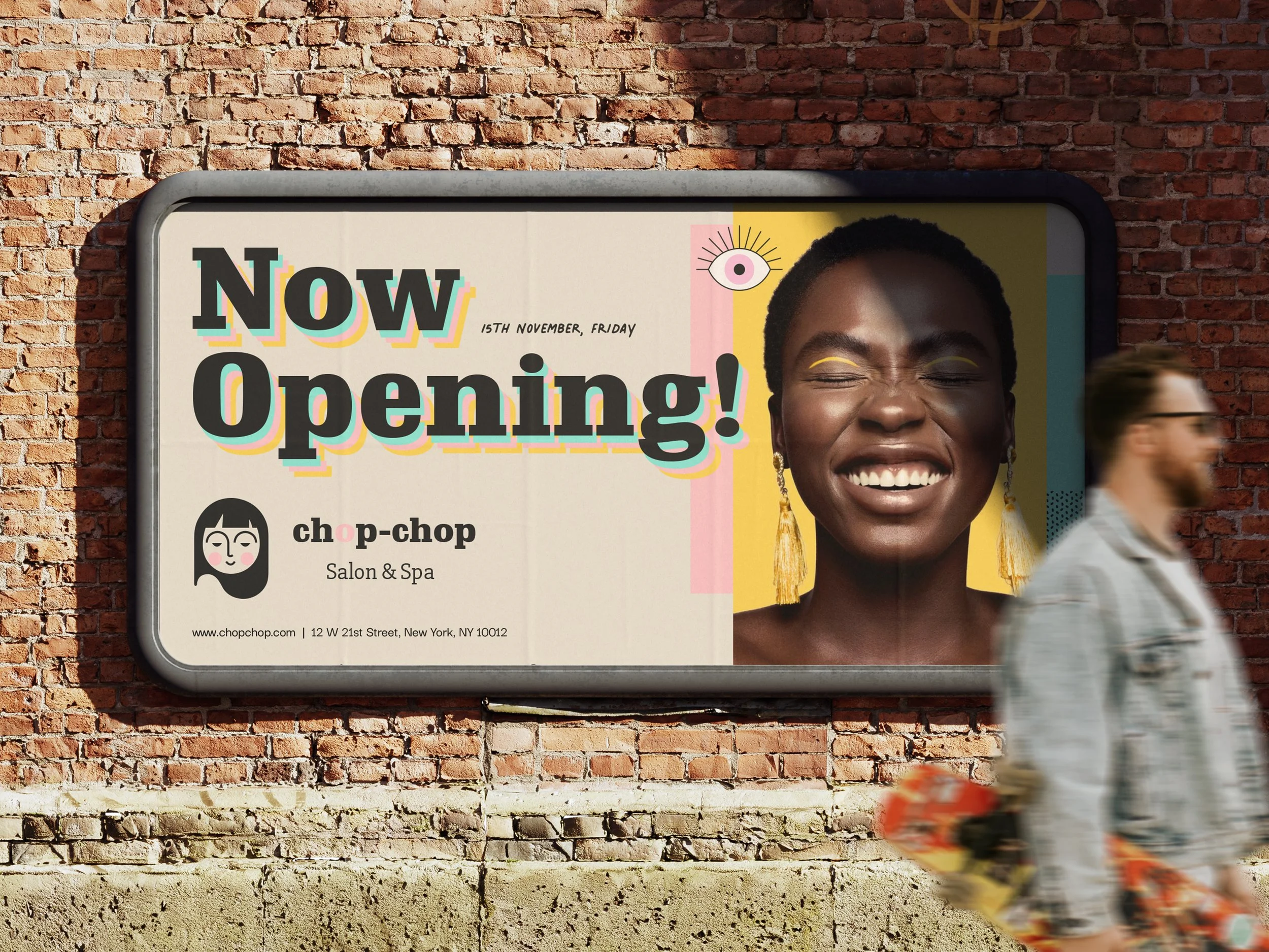
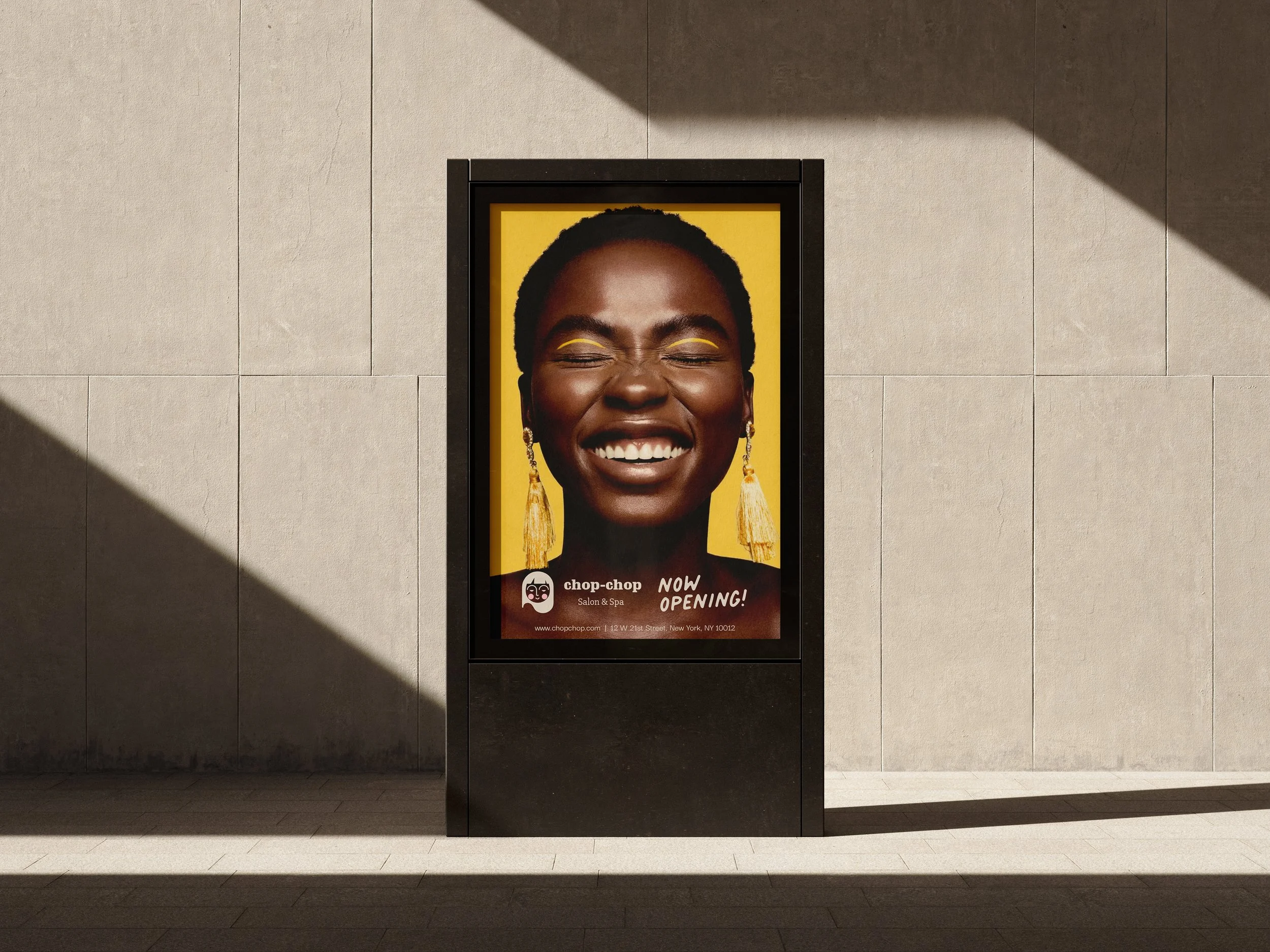
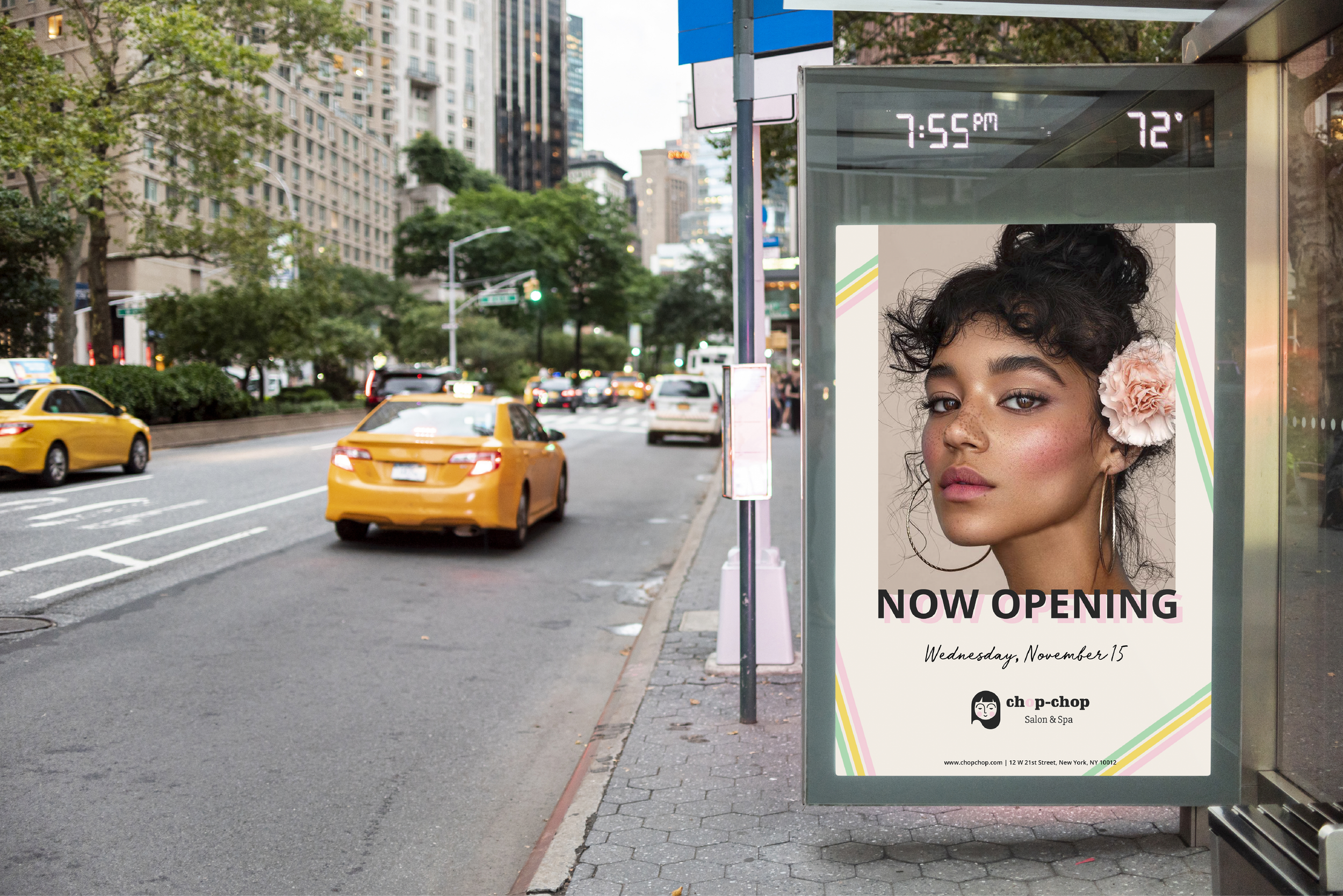
The name Chop-Chop already had energy — urgent, playful, a little cheeky. The brand needed to match it. I wanted to avoid the soft, muted aesthetic that dominates beauty branding right now and instead build something that felt confident and vibrant — a brand that stands out in a crowded market rather than blending into it.
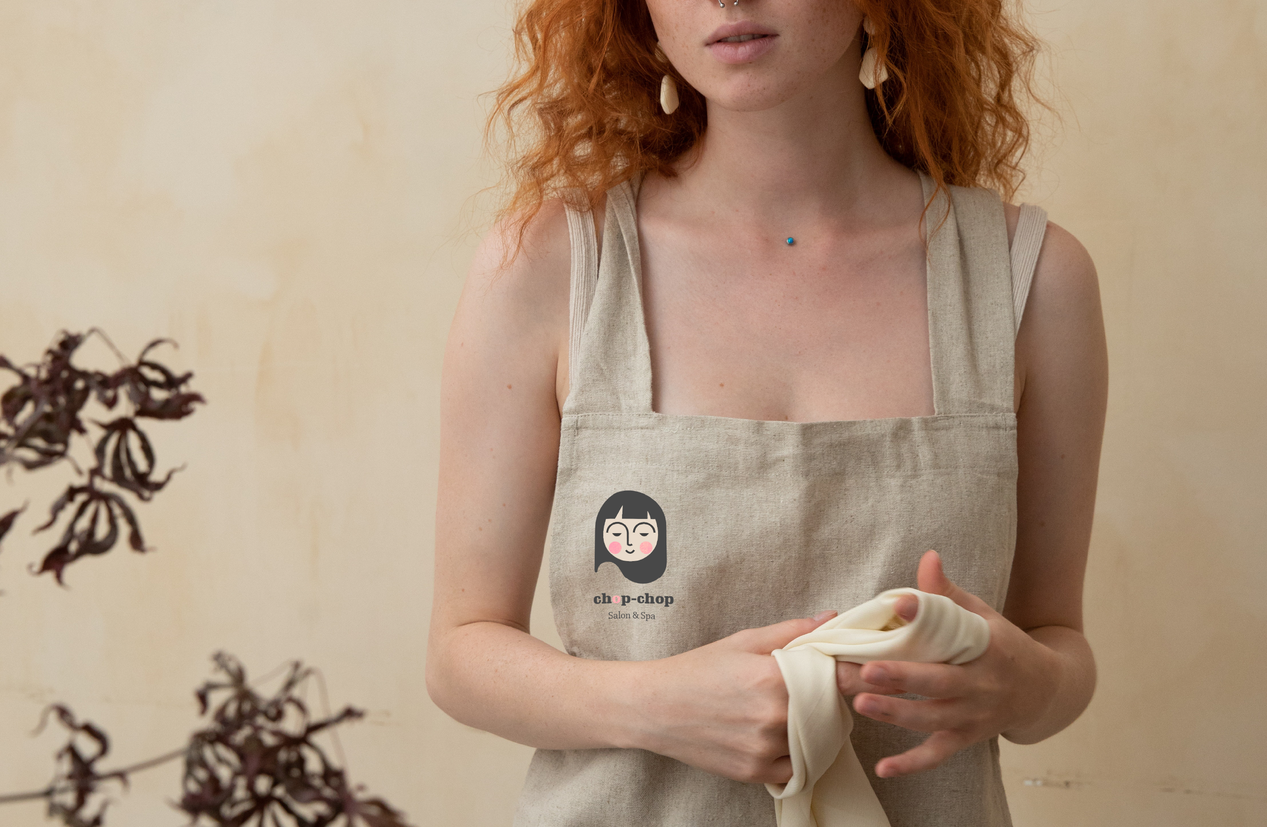
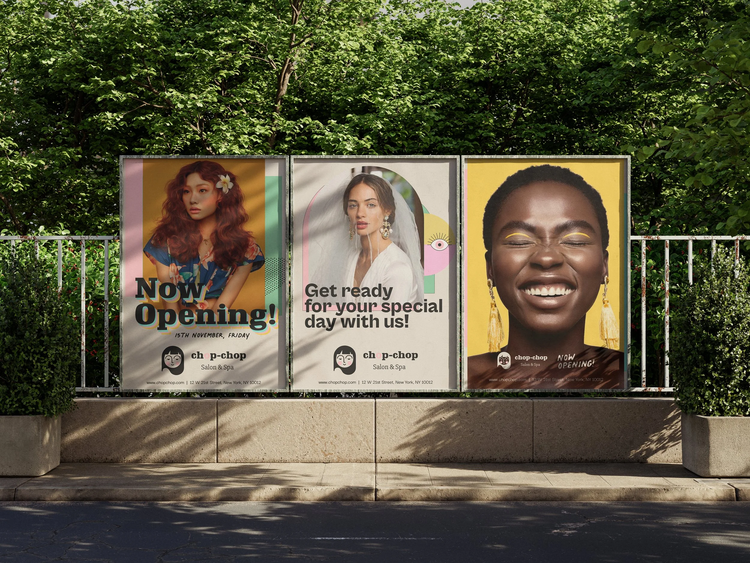
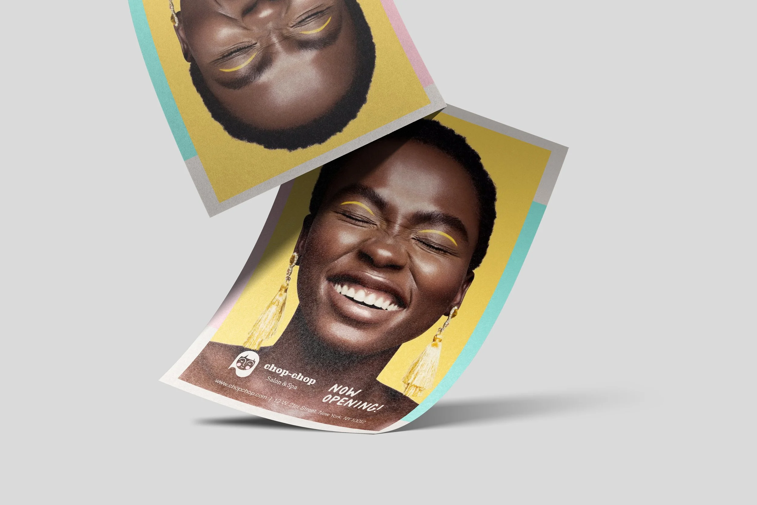
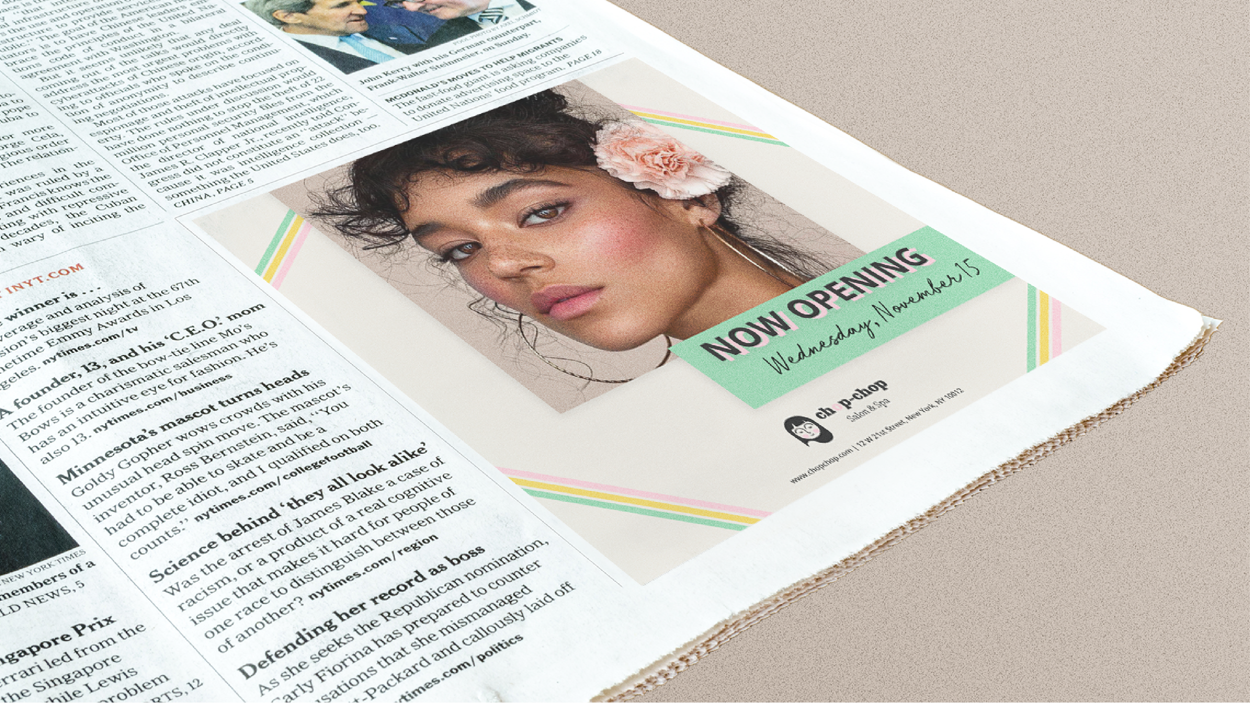
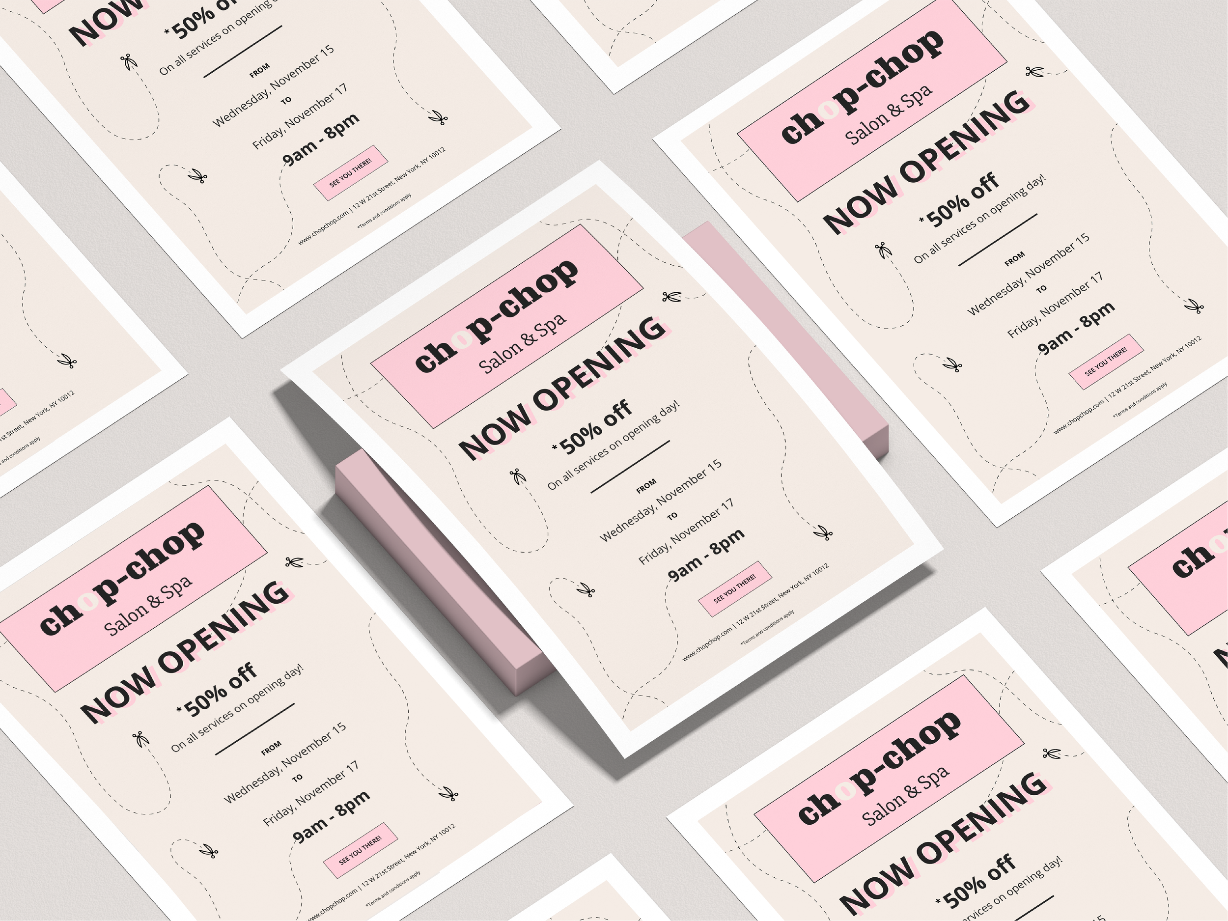
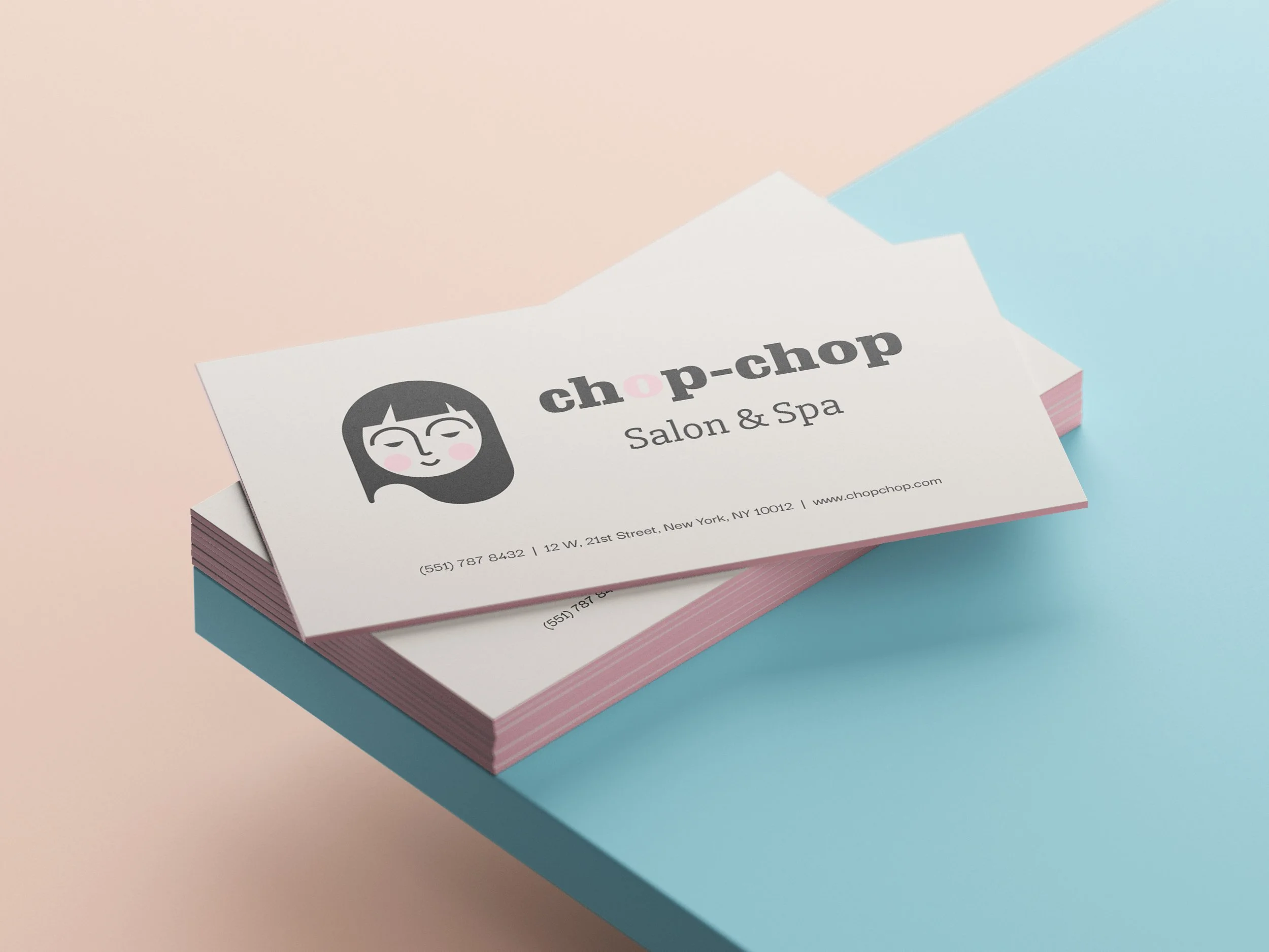
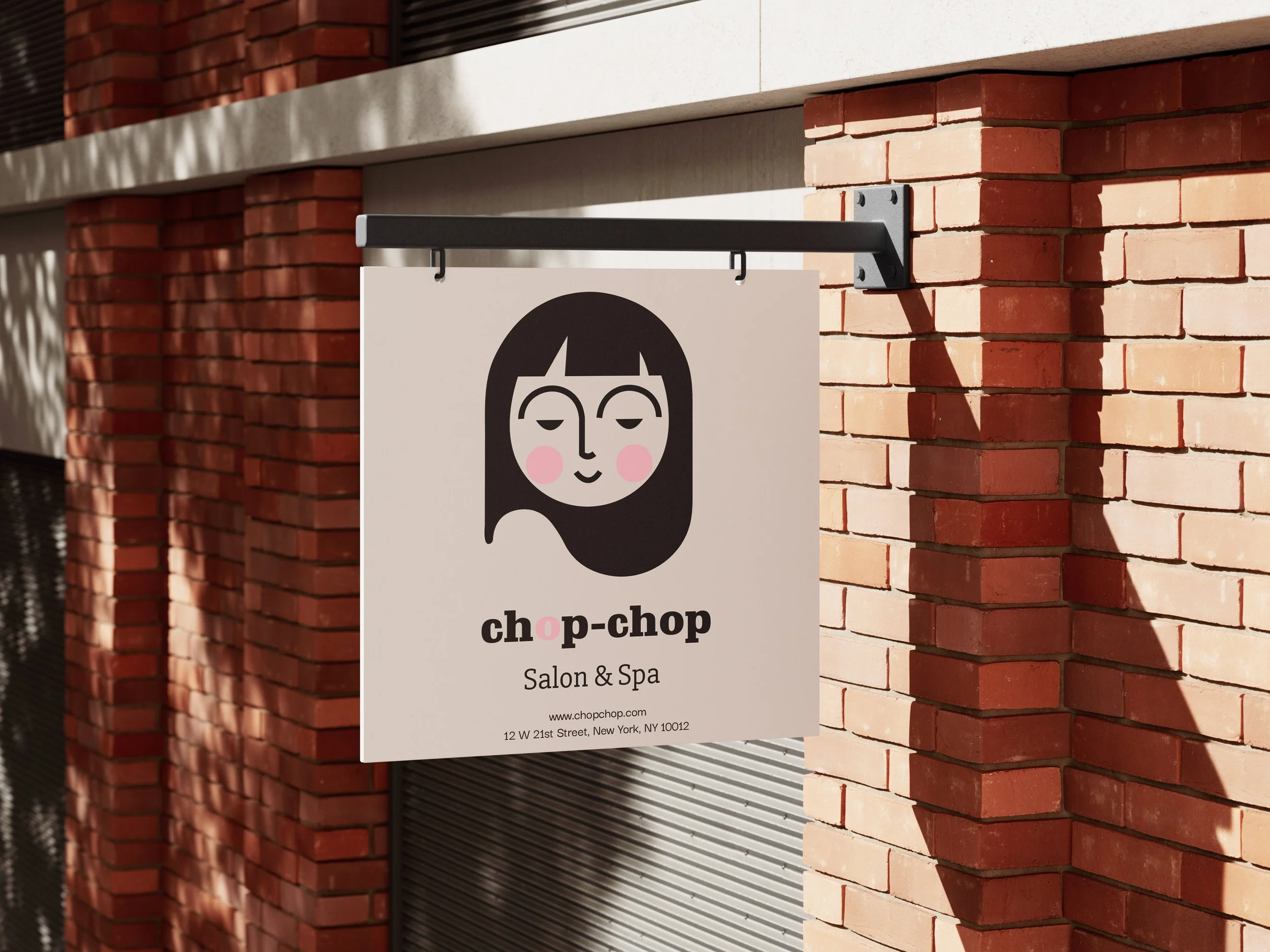
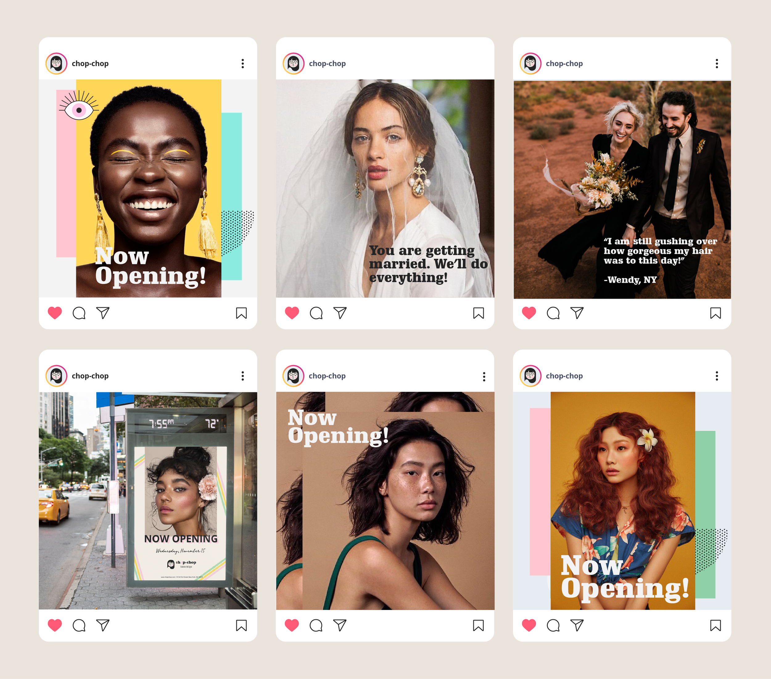
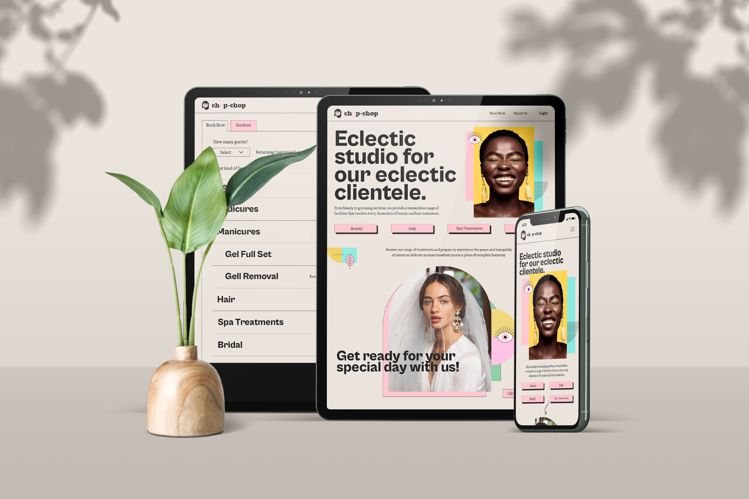
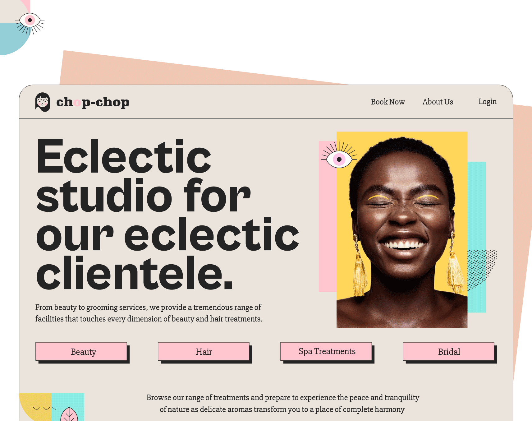
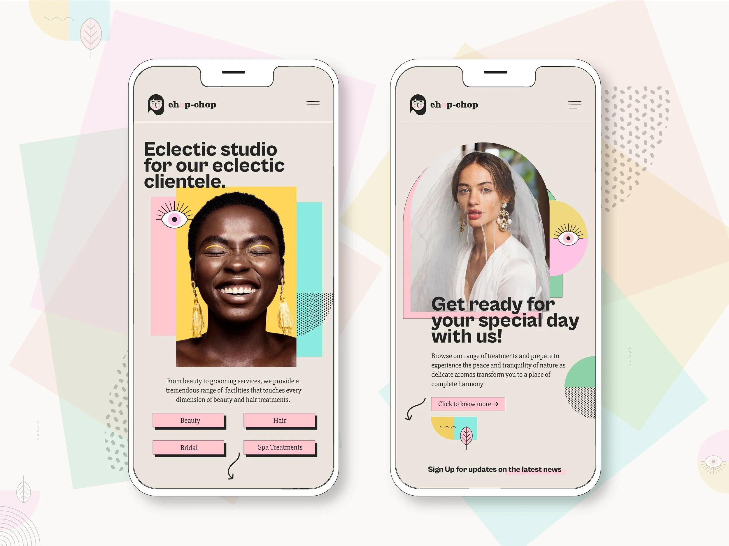
The colour palette is bold and intentional, chosen to feel aspirational without being inaccessible. Typography is clean and direct — the brand has something to say and doesn't mumble. The visual system was designed to be flexible enough to work across every touchpoint, from in-salon signage to Instagram templates to bus stop ads, while remaining immediately recognisable at every scale.
The marketing strategy centred on building presence across both physical and digital channels simultaneously — print media for local awareness, social media and paid digital for reach, and a marketing landing page to convert interest into bookings.
What I Learned
This project taught me a lot about designing systems rather than just assets — every piece had to work independently and as part of a whole.
Deliverables
Visual identity · Brand guidelines · Merch · Signage · Stationery · Print · Social media templates · Marketing landing page · Hi-fidelity UI screens